REFERENCE
PASSION AND EXCITEMENTS
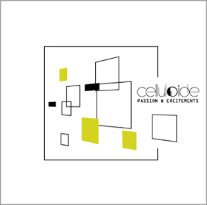
The design of the booklet of the CD is a 3D adaptation and rotation of a painting of the De Stijl movement. (once again!) The square have first been re-arranged and then filled with the new 'Bodypop' green. Note that only 3 squares are green, they symbolize the fact that it's the 3rd album of the band. Then instead of a simple plan, the squares have been disposed at different position in space to recreate the painting when you see it in front... but when you can rotate the whole construction, as it is on the front page of the booklet, you can discover that each square is on a different level and separate as many different objects to compose a whole when seen in front. As for Bodypop EP, the modernism is expressed by the use of perspectives, but as a new evolution for the band's sound, a new step is made with this representation in real 3D.
The design of the booklet of the CD is a 3D adaptation and rotation of a painting of the De Stijl movement. (once again!) The square have first been re-arranged and then filled with the new 'Bodypop' green. Note that only 3 squares are green, they symbolize the fact that it's the 3rd album of the band. Then instead of a simple plan, the squares have been disposed at different position in space to recreate the painting when you see it in front... but when you can rotate the whole construction, as it is on the front page of the booklet, you can discover that each square is on a different level and separate as many different objects to compose a whole when seen in front. As for Bodypop EP, the modernism is expressed by the use of perspectives, but as a new evolution for the band's sound, a new step is made with this representation in real 3D.